forest_plot(my_results,
            col.key     = "subgroup",
            row.labels  = row_labels,
            bold.labels = "overall",
            diamond     = "overall",
            fill        = "white")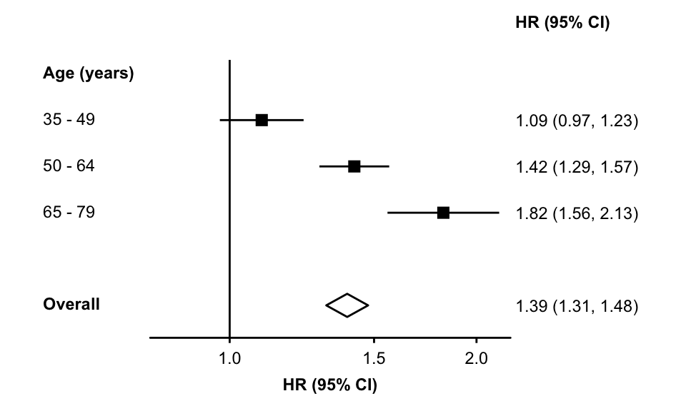
It is common to show an “overall” or meta-analysis summary estimate in a forest plot using a diamond.
forest_plot(my_results,
col.key = "subgroup",
row.labels = row_labels,
bold.labels = "overall",
diamond = "overall",
fill = "white")
To add a vertical line at the “overall” estimate you can use the add argument of forest_plot.
First, create a geom_segment ggplot2 object. The x-position of the line is estimate_transformed and the line will start at row (i.e. the same y-position as the diamond) and end at 1.5 (i.e. just above the row of the first estimate). The data argument is a function that will filter the plot data to leave only the one row (in this case, where key == "overall"). Other arguments are used to control the style of the line.
overall_line <- geom_segment(aes(x    = estimate_transformed,
                                 xend = estimate_transformed,
                                 y    = row,
                                 yend = 1.5),
                             linetype = "dashed",
                             colour   = "grey40",
                             data     = \(x) dplyr::filter(x, key == "overall"))
Then add overall_line to the plot using the add argument. By setting it as the list element named “start”, the line will be plotted behind the boxes and lines used for estimates and confidence intervals.
forest_plot(my_results,
            col.key     = "subgroup",
            row.labels  = row_labels,
            bold.labels = "overall",
            diamond     = "overall",
            fill        = "white",
            add         = list(start = overall_line))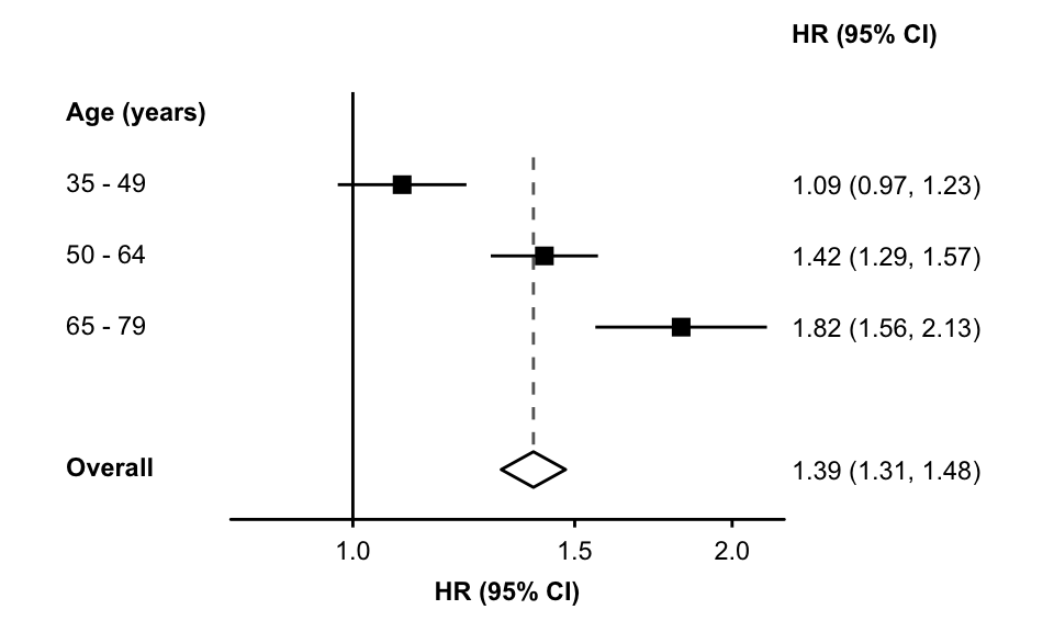
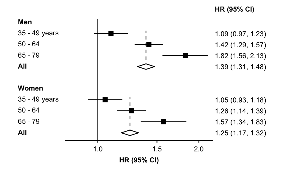
By changing the data function and y aesthetic in the added layer, separate lines can be added for each section.
overall_line <- geom_segment(aes(x    = estimate_transformed,
                                 xend = estimate_transformed,
                                 y    = row,
                                 yend = row - 3.25),
                             linetype = "dashed",
                             colour   = "grey40",
                             data     = \(x) dplyr::filter(x, key %in% c("men", "women")))

forest_plot(my_results2,
            col.key     = "subgroup",
            row.labels  = row_labels2,
            bold.labels = c("men", "women"),
            diamond     = c("men", "women"),
            fill        = "white",
            add         = list(start = overall_line))